
Loading interactive graphic…
Interactive historical example
Where the world lives in cities
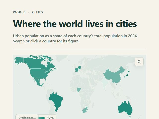
A sourced public indicator becomes a comparable country view with accessible search and place details.
SourceWorld Bank WDIUse this template ↗
Solutions for teams
Explain programs, outcomes and change with accessible visual stories that make the evidence clear and the organization accountable.
Show how program outcomes changed by region and explain the largest gaps
Working graphics, real data
Every example below is rendered from a shipped Storycards Visual Spec and a cited historical dataset. Hover, tap and use its controls here, then open the same structured template to adapt it.
Interactive historical example
A sourced public indicator becomes a comparable country view with accessible search and place details.

Interactive historical example
A public dataset becomes an accessible pattern that can guide communication and intervention.

Interactive historical example
Program outcomes stay disaggregated, sourced and readable across devices.
Why Storycards
Storycards helps communications, policy and impact teams move from official data to a clear public-facing story. Keep sources visible, apply an approved identity and publish responsive visuals that work across devices and languages.
What it helps you do
Show where figures came from and keep context attached to the visual.
Transform dense reports into focused stories about progress, gaps and tradeoffs.
Create responsive, multilingual visual experiences.
Update recurring indicators while retaining published versions and project history.
One connected workflow
Research with AI, upload a table, sync Google Sheets or connect a Live API.
Choose the story structure, edit the data and control copy, chart, layout, interaction and motion.
Use Brand Kits, team templates and clear project ownership to make the work repeatable.
Ship a responsive Smart Embed with live updates, immutable versions and safe rollback.
Practical guide
Turn official datasets and impact reports into accessible visual explanations for residents, partners and donors. Sources and context stay visible so the result can support public trust.
Pair each figure with the definition, period and official source people need to interpret it correctly.
Refine responsive layouts, readable labels and localized versions before publication.
Update recurring indicators through controlled snapshots while retaining reviewable published versions.
What else you can create
Questions
No. Start with a research question, upload a table or connect a supported live source.
Yes. Data, text, charts, layout, interaction and motion remain structured and editable.
Use a responsive Smart Embed or share link, with version history and safe rollback for published work.
Storycards Infographics
Start free with your data — or simply ask the question.
Create freeNo credit card required.